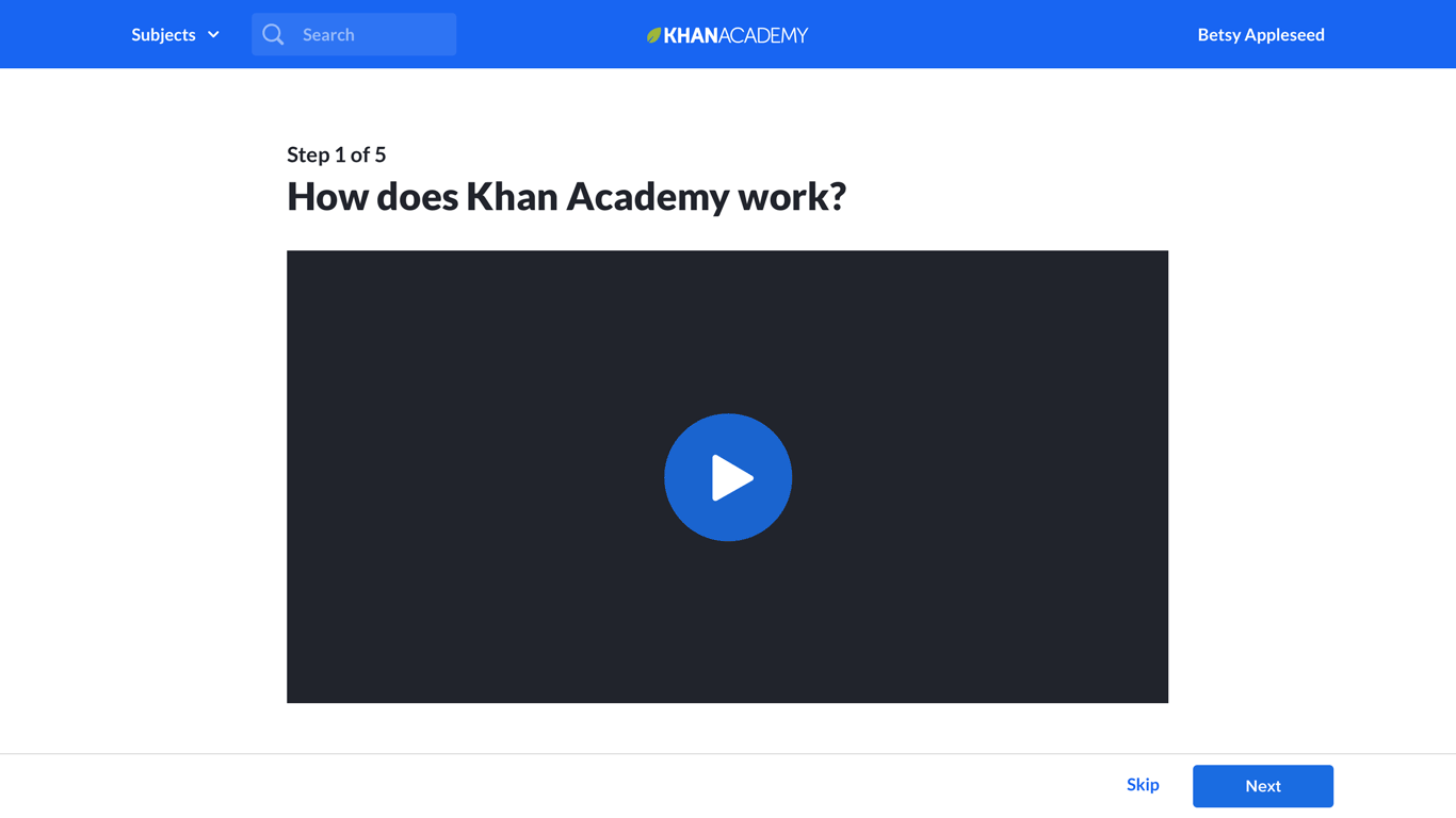
Khan Academy teacher onboarding
Context: Increase activation for new teachers
In February 2018, I was working as lead designer for the Growth team at Khan Academy. The previous fall, I had done a stint working as the Student Marketing Manager for Khan Academy but had returned to the design team to work on Growth.
My product manager and I recognized that our growth goals would best be met by engaging more teachers—they can not only bring in all of their students (which can range from 20-120 students), but by incorporating Khan Academy into their classroom, they can drive consistent usage. And engaged teachers often return year over year.
Our primary deadline was the back-to-school season, which begins in August, and is when Khan Academy has a huge spike in teacher signups. With our small team, including three developers and a data analyst, we set out to increase the new teacher activation rate—"activation" being indicated when a teacher adds students to their Khan Academy class.
All of the illustrations for the teacher onboarding were created by another designer, Elizabeth Lin. She had created the original pencil + kid characters for a one-off illustration. I really liked the character design and was very fortunate to get her time to create the illustrations for the onboarding experience.
For Halloween at the office, I brought Pencil Pal into full effect:

Opportunity: Existing onboarding wasn't demonstrating product value
Our existing onboarding flow for teachers was a wizard that walked through choosing a subject and quickly adding their students. From our teacher marketing manager, we learned that:
-
Teachers wanted to explore and evaluate our content before committing to adding their students.
-
We were not successfully demonstrating the power and utility of our activity reports, which provide important insights to teachers.
-
Teachers were unclear on how to fit Khan Academy into their classroom routine.
Project kick-off: One-week design sprint
To begin, we ran a one-week design sprint to create and test a new approach to onboarding. In that focused week, we:
-
Gathered ideas and input from teacher-focused coworkers at Khan Academy, including marketing and teacher support.
-
Created storyboards and identified the key experiences to include with teacher onboarding.
-
Designed and implemented a prototype of the onboarding experience and tested it with several teachers new to Khan Academy whom we recruited.
Here's a quick gif of some key screens from the prototype:
From testing our prototype with teachers, we gained several important insights:
-
Teachers are eager to get into the product experience and are very likely to skip video tutorials.
-
Teachers really loved exploring the content, but our prototype wasn't actively shepherding them to go beyond content exploration.
-
By trying out what their students will primarily be doing, answering practice questions, they experience the instant feedback and moment of celebration, which really resonated with them.
-
Especially because teachers were skipping the video, we needed a way to demonstrate the power of our reports to them.
We took our ideas from the design sprint and started developing designs and running quick A/B tests.
At the same time, we decided to make a larger investment in a "demo class" experience, where teachers would experience one full loop of assigning content to their students and then using the reports.
Quick detour: Let's raise sitewide teacher signups by 16%, shall we?
As I started developing a suite of designs for us to test, I did an audit of our existing pathways into teacher signup. In doing so, I identified two juicy pieces of low-hanging fruit for us to pick when teachers land on one of our video pages after Googling for content:
-
If a teacher signed up from one of our video pages, rather than taking them into teacher onboarding, we were returning them back to that content page to watch the next video.
-
We weren't doing anything on these pages to communicate to teachers that we had a teacher/classroom product they should check out.
Our team ran a quick experiment to guide these new teacher signups from video pages into onboarding rather than returning them to the video page. This yielded an instant increase in the number of teachers who added at least one student to their class.
Next, we ran an experiment that showed a popup on the bottom right of math video pages five seconds after landing, hypothesizing that many teachers were visiting our video pages, but that we weren't letting them know that we had free teacher tools:

This experiment, reaching out to teachers on content pages, drove a site-wide 16% increase in teacher signups. That number is not just the difference in signups from content pages, but includes every way that teachers would sign up, including through signing up from the main khanacademy.org home page.
Our primary solutions: 4 different areas
We created designs for five different areas to improve our teacher onboarding:
-
Demo class: A sample click-through experience for teachers that showcases our content, student experience, and reporting.
-
Auto class: Teachers begin by choosing their subject; we automatically create their first class for them and have them explore our exercise content.
-
Content exploration: UI improvements to our content browsing tools for teachers.
-
Rostering: Clean up and simplify the options and flow for rostering students
Piece 1: Demo class
The "Demo class" was the largest investment our team made in teacher onboarding. Through earlier testing with our prototype, we identified that teachers would skip intro videos, so we didn't believe we could rely on that as a primary way of communicating how our product would work for them.
We had also learned that trying out a relevant practice question and seeing our question banks was extremely important to teachers—our content is the real "product" that teachers are evaluating.
We also knew that successful teachers loved our powerful reporting, but through normal usage, a teacher wouldn't really experience the reports until days after committing to using the tool.
As an alternative to the Demo Class, we considered creating a fully-interactive sample class filled with in-progress student activity data that the teacher could explore. We did not take this path because:
-
Creating a fully interactive sample class was going to be a much larger dev investment, and it also posed serious data challenges.
-
Other snapshot samples we looked at in other products could be difficult to understand because it wasn't clear how things had gotten into that state—there was a bunch of data, but the context was unclear.
Demo class: Key experience components
To guide the teacher through the demo experience, I designed three primary devices:
Pencil Pal Popovers + Focus areas

Popovers are the main method for guiding the teacher through the story. Backdrop "focus areas" highlight what they should be focusing on and control the pieces of the UI they are able to interact with. Our devs Ian and Kairui created this new system to support the demo experience.
Each guider popover has a CTA that triggers the same action as if the teacher were to click on the item being pointed to, so there's no confusion for the teacher about where to click. I also wanted it to always be very obvious to the teacher how to move forward.
Narrative modals

At different points in the experience, I use modals to cue up what's going to happen next, fill in the story of what students are doing, or congratulate the teacher.
I included the "Answer one question" modal above because it came right before the one open-ended piece of the experience, where the teacher answers a question. Without it, it was possible to have a hiccup and be unclear about what to do on the following question screen, because there was no explicit popover + CTA to go to the next step.
Another place we used the modal was in a bit of storytelling glue after the teacher creates an assignment for their sample students, bridging the story to where they check out their reports.
Progress bar
As the demo class experience is significant in length, we chose to create a progress bar to help motivate the teacher through the experience.
I worked with Elizabeth, illustrator for the project, to put together an animated "progress bar" of a bus picking up kids for school. We ended up not having time to implement it in product, opting instead for a trimmed down and more traditional progress bar. But here's a short clip with very rough animation and Elizabeth's illustrations that I put together to capture the idea:
Demo class: Try a single question
Before entering the demo class, we ask the teacher what subject they are teaching. Based on this, we create a demo class that showcases content for that subject. I worked with our math content manager to find potential sample exercises for each subject. I specifically selected each sample exercise using these criteria:
-
It should be quick for someone who knows the content to answer quickly (e.g. doesn't require a bunch of calculations/steps).
-
It should be very relevant and common content they'd want to assign to their students.
-
It shouldn't involve complicated UI interactions that could potentially confuse someone, even if the interactive experience is cool.
-
Its content should fit on a small laptop screen, so no scrolling would be required.
Because this was the one place where we were explicitly having the teacher try the student experience, I wanted to make sure they didn't get bogged down and had a positive experience.

After trying a practice question and looking at the full bank of questions that their students could be asked, I took the teacher through the step of assigning that practice exercise to their sample class.
Optimizing demo class
Once we put demo class into A/B testing, our team's product analyst Cathleen Li pulled metrics and funnel data. We discovered several interesting things:
-
The number of new teachers adding ten students to their class (our bar for indicating they're committing to trying the product with their students) increased by 5%. Great news!
-
However, the number of new teachers adding one or more students to their class decreased by 3%. That's weird...
We realized that what was happening is that in the past, teachers would add themselves to their own class as a student in order to test out the experience, thereby triggering the "added 1+ students" metric. But with our new onboarding, fewer teachers felt the need to do this hack because our new experience (not just demo class, but the whole suite of improvements) gave them the understanding they were looking for.
We also saw that teachers were very interested in the tour of the reporting tools; for virtually all of the teachers who reached that part of the tour, they completed the full tour.
We also discovered trouble spots in our demo class flow, which we patched:
-
67% of teachers were trying out the demo class, and we wanted to increase that number. I identified that in production, we had a technical delay that was causing a multi-second wait before the option to start the demo would become enabled. Working with dev Ian Reynolds, we were able to do some load reordering so the CTA would never be disabled. Fixing this increased the number of teachers trying demo class to 77%.
-
We tightened up the interstitial animation after the teacher creates an assignment and their "sample students are working" and increased that throughput from 92% to 97%.
With those and other tactical improvements, with a quick investment, we increased the number of teachers completing the demo class experience by 15%.
Piece 2: "Auto class"
The second major area of improvement was in streamlining getting teachers to exploring our content. In the existing flow, we were prompting teachers to roster their students before they ever even saw our content—but our new research indicated to us that exploring content was the first thing they wanted to do and rostering students was the last.
I changed the flow so that the teacher begins by choosing the courses they're teaching:

Next, we prompt them to take the sample class tour ("demo class"). After that, we automatically create a real class for the course they selected (thus "auto class"):

After they give their class a name (or optionally roster import their existing class info and roster from Google Classroom), we highlight the breadth of our practice exercise content for their course and ask them to find an exercise they'd want to assign to their students.
We learned that many teachers think that Khan Academy is primarily videos, but for classrooms, we consider our practice exercises our most valuable content—as well as what teachers are most often looking for.

Piece 3: Content exploration

We knew that content exploration was a critical step for teachers, but we weren't satisfied with the current state of our content browsing experience, which looked like this:

We identified a number of shortcomings:
-
Each item contained a long description that no one read and that primarily served as visual noise that drowned out the rest of the text.
-
There was little visual interest and nothing to help distinguish different units or invite clicking into them.
-
The content type (video, article, exercise) was difficult to distinguish, being indicated by small text label that was hard to find despite being a super-key piece of info.
-
Each content item had a separate "Preview" link rather than just being able to click on the content name to view it.
-
It wasn't clear that the top-level "units" were containers for lessons and content items.
To address these, I tried a range of visual explorations. This one tried out icons to strongly distinguish the individual content types, especially be segregating out exercises into their own column:

In this one, I tried out including thumbnails of the video and exercise content:

The final design dialed back this differentiation and instead used new icons that Elizabeth Lin designed as part of an overall icon system overhaul:
Teachers we tested with found the new design much easier to navigate, and when A/B tested in isolation (without the other new onboarding pieces), teachers were more successful in finding and previewing content (statistically significant results).
My design addressed the key shortcomings:
-
We cut the long descriptions in favor of short functionally useful ones, e.g. "Lesson: 1 exercise, 3 videos, 1 article".
-
Adding top-level unit icons added visual interest and drove teachers to click into the contents deeper in the tree.
-
Icons for the different content types made them easier to distinguish.
-
We ditched the "Preview" link in favor of making the whole row clickable to preview the item.
-
We added description for what top-level "units" contained, e.g. "36 exercises, 45 videos...," though we did not implement this in production because calculating that information proved too computationally expensive.
After shipping this, I did another iteration to add a new feature, the ability to assign students to work in a special "Unit mastery" mode that is different from assigning individual pieces of content. In exploring this, I ended up finding an improved solution for initially highlighting the lessons within the unit rather than just the top-level units. However, this feature was put on hold and this UI was not shipped.

Only after the teacher has had a chance to explore our exercise content do we now push them to take the step to roster their students:
Piece 4: Rostering

Pressing the "Add your students" CTA opens the rostering modal I revised (icon illustrations by Elizabeth Lin):

We chose to revise the rostering flows because the step of adding students to your classroom is a critical metric, as it indicates that the teacher is ready to commit to trying the product. We wanted to ensure that process was as easy as possible.
Here is what the previous rostering UI looked like:

I identified several shortcomings to address:
-
We had a /join url where students could go to and enter this code, but the teacher typically needed to project or write this info somewhere and the students needed to transcribe the code correctly, leading to friction.
-
We weren't properly communicating how you'd decide between these different options.
-
40% of teachers were opting to create accounts for their under-13 students because of our messaging, but most of those students could instead be signing in with their school Google accounts, which is a much easier flow.
-
In working with our product analyst to look at email invitation usage, I discovered it was 1) used by a relatively small percentage of teachers, 2) sent students through a pipeline I had originally designed five years ago that hadn't been kept updated, and 3) involved a whole bunch of code. I realized this was the perfect chance to sunset this feature.
Here's one early visual exploration, which emphasized helping teachers decide which option to choose:

The final version also included the priority ordering we wanted to communicate, from easiest to hardest:
I also eliminated the fourth option, triggering email invitations to your students, by replacing it with the ability to share a general link with your students however is most convenient for the teacher—through email, or through some other way of messaging their students, or projecting it in the classroom:

Previously, students would have to visit /join and then type in a class code. In my new flow, that option was still available, but the more direct option was to go directly to the class-specific link, simplifying their signup experience further.
Conclusion
Our company's #1 metric is "MVALs"—Monthly Very Active Learners, learners who spend 120+ minutes a month learning with us. This reflects Khan Academy's primary interest in driving deep usage and learning, not just quick learning help.
The key driver of classroom MVALs are our MVATs—Monthly Very Active Teachers, defined as a teacher who has 10+ MVAT students.
The combination of our improvements to teacher onboarding yielded a statistically significant 11% increase in the percentage of new teachers who became MVATs, our most valuable users. Our team's impact on the teacher funnel was a huge win for the company.